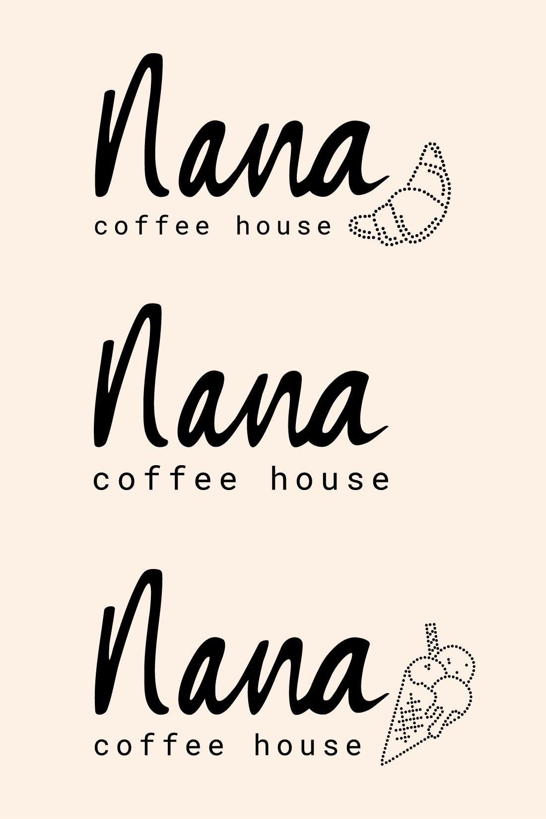
One of the bigger projects Beatrice Jolly and I did was designing the branding for a new cafe in Amsterdam; Nana Coffee House. The concept was inspired by the owner’s grandma — Nana. In her young days, people wouldn’t just come to a coffee house for a quick cup but rather sit there all afternoon for bites, sweets, drinks, chats and the warm hospitality of the baristas. This is now the core value of Nana Coffee House.
With this concept in mind, we wanted to create a brand design that reflected just that. It had to be sweet but simple, a little quirky and most importantly, warm.
The concept and design direction was done by Beatrice Jolly and the graphic design was made by me.


